Type
The Type tab configures the font properties for each layout component. Each layout component has properties for normal text, heading tags (h1, h2, h3), and links (with additional pseudo-classes: visited, hover, active, focus).
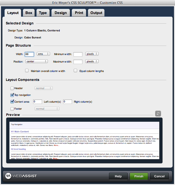
Layout Component control
Layout components provide the structure for the layout of the page. Selecting a layout component within the control enables the corresponding property controls immediately below it, allowing you to configure the properties of that component directly. The following briefly describes the layout components and hierarchy used to structure your page layout and design:- body: the body tag for the page. Listed at the top of the layout control, this tag encompasses all content displayed on the page. Only the margins and padding are available properties for configuration for this layout component.
- outerWrapper: encompasses all of the <div> tags used to construct the page. Contains the three content subdivisions: header, contentWrapper, and footer.
- header: the top content region of the page, optional for display
- topNavigation: the top navigation region, optional for display. This is selected by default for all SiteAssist layouts.
- footer: the bottom content region of the page, optional for display
- contentWrapper: the central content region of the page, this area contains the content section, as well as any additional column(s) defined for the page.
- content: the central content area vertically between the header and the footer
- columns: additional content areas to the left and right of the central content area, vertically between the header and the footer
Type
This section controls the text properties, as described below the figure, for multiple text classes available for each layout component. Properties for standard text and heading tags (h1, h2, h3, etc.) are available. As well, pseudo-classes for links are available as listed below.- Link: applies to links that have not yet been visited.
- Visited: applies to a link once it has been visited by the user
- Hover: applies to the an element while the user designates it with the cursor.
- Focus: applies to an element has the focus (accepts keyboard events or other forms of text input).
- Active: applies to an element when activated by a user. For example, between the time the user presses the mouse button and releases it.
Font: Multiple preset lists of standard font families. This field is also user editable, allowing you to directly specify font(s) specific to your requirements. Available font-families for selection are:
Line height: Sets the distance between lines to normal or a numerical value. Numerical entries can be selected or entered manually for the following unit standards available for selection: pixels, points, in, cm, mm, picas, ems, exs, %
Decoration: Sets the text with the following decorative properties:
- Arial, Helvetica, sans-serif
- Arial Black, Gadget, sans-serif
- Comic Sans MS, cursive
- Courier New, Courier, monospace
- Geneva, Arial, Helvetica, sans-serif
- Georgia, Times New Roman, Times, serif
- Impact, Charcoal, sans-serif
- Lucida Sans Unicode, Lucida Grande, sans-serif
- Palatino Linotype, Book Antiqua, Palatino, serif
- Times New Roman, Times, serif
- Verdana, Arial, Helvetica, sans-serif
- Tahoma, Geneva, sans-serif
- Trebuchet MS, Helvetica, sans-serif
- 9, 10, 12, 14, 16, 18, 24, 26: numerical entries can be selected or entered manually for the following unit standards available for selection: pixels, points, in, cm, mm, picas, ems, exs, %
- xx-small, x-small, small, medium, large, x-large, xx-large
- smaller, larger
- normal, bold
- bolder, lighter
- 100, 200, 300, 400, 500, 600, 700, 800, 900
- normal: standard display text format
- italic: italicized format
- oblique: slants the characters, used in place of italic by default if italics is not available for the selected font style
Line height: Sets the distance between lines to normal or a numerical value. Numerical entries can be selected or entered manually for the following unit standards available for selection: pixels, points, in, cm, mm, picas, ems, exs, %
Decoration: Sets the text with the following decorative properties:
- underline
- overline
- line-through
- blink
- none
- capitalize: first letter of each word is capitalized
- lowercase: all lowercase letters
- UPPERCASE: all uppercase letters
- none