Design
The design tab configures the background and border properties for each layout component.
In Dreamweaver CS3, the Design View may not always render the background as it is designed. However, when previewed in a browser, your background will appear correctly based on your settings.
Color: Sets the background color for the selected layout component.
Image Source: Specifies the location of an image to be applied to the background.
Image Repeat and Attachment: Specifies if the provided background image is repeated on the page, as well as if it is stationary or moveable relative to scrolling through content on the page.
Image Position: Specifies the position of the background image using relative or absolute properties.
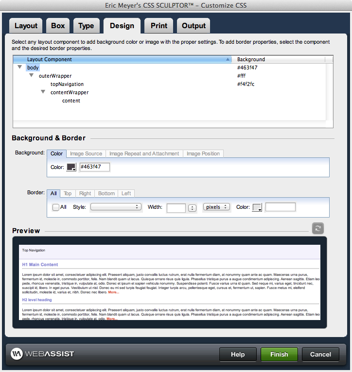
Layout Component control
Layout components provide the structure for the layout of the page. Selecting a layout component within the control enables the corresponding property controls immediately below it, allowing you to configure the properties of that component directly. The following briefly describes the layout components and hierarchy used to structure your page layout and design:- body: the body tag for the page. Listed at the top of the layout control, this tag encompasses all content displayed on the page. Only the margins and padding are available properties for configuration for this layout component.
- outerWrapper: encompasses all of the <div> tags used to construct the page. Contains the three content subdivisions: header, contentWrapper, and footer.
- header: the top content region of the page, optional for display
- topNavigation: the top navigation region, optional for display.
- footer: the bottom content region of the page, optional for display
- contentWrapper: the central content region of the page, this area contains the content section, as well as any additional column(s) defined for the page.
- content: the central content area vertically between the header and the footer
- columns: additional content areas to the left and right of the central content area, vertically between the header and the footer
Background and Border
Background
The background section sets the properties for the background of a selected component. Each of these properties is broken across several tab: Color, Image Source, Image Repeat and Attachment, and Image Position. The first tab configures the background color for a specific layout component. The remaining three configure the attributes and location of a background image applied to the selected layout component.In Dreamweaver CS3, the Design View may not always render the background as it is designed. However, when previewed in a browser, your background will appear correctly based on your settings.
Color: Sets the background color for the selected layout component.
- Color: Use the color-picker or enter the color value. The color value can be a color name (red) or a hex number (#ff0000).
Image Source: Specifies the location of an image to be applied to the background.
- Filename: Use the browse icon or manually enter the http:// location or a site relative location for the image.
Image Repeat and Attachment: Specifies if the provided background image is repeated on the page, as well as if it is stationary or moveable relative to scrolling through content on the page.
- Repeat: Sets if/how a background image will be repeated. Available options are:
- repeat: repeats the image vertically and horizontally
- repeat-x: repeats the image vertically
- repeat-y: repeats the image horizontally
- no-repeat: does not repeat the image
- Attachment: Sets whether the background image is fixed or scrolls with the rest of the page.
Image Position: Specifies the position of the background image using relative or absolute properties.
- Horizontal: Sets the position of the image horizontally. Available options are left, center, right, or a numeric value. Numerical values are entered directly with the following unit standards available for selection: pixels, points, in, cm, mm, picas, ems, exs, %
- Vertical: Sets the position of the image vertically. Available options are top, center, bottom, or a numeric value. Numerical values are entered directly with the following unit standards available for selection: pixels, points, in, cm, mm, picas, ems, exs, %
Border
This section sets the border properties for the selected layout component. You have the option of setting the same border properties for all four sides of a component using the All tab, or setting individual properties for each of the four sides of a component: top right, bottom, and left. Enabling properties in the All tab disables configuration in the other four tabs. The border column in the Layout Component control, when All is selected, displays shorthand for the border attributes applied. Otherwise, it will display top, bottom, right, or left for any tabs with information entered.- All: Only available in the All tab, this disables individual configuration of the sides of a layout component, and applies all properties specified to all four sides.
- Style: Sets the style of line displayed for the border. Available options are: none, hidden, dotted, dashed, solid, double, groove, ridge, inset, outset
- Width: Sets the width of the line drawn for the border. Options are thin, medium, thick, or a numerical value. Numerical values are entered directly with the following unit standards available for selection: pixels, points, in, cm, mm, picas, ems, exs, %
- Color: Use the color-picker or enter the color value to set the color for the border. The color value can be a color name (red) or a hex number (#ff0000).