Customizing Design: Form Elements - Datepicker
This interface allows you to customize the appearance of the Datepicker.
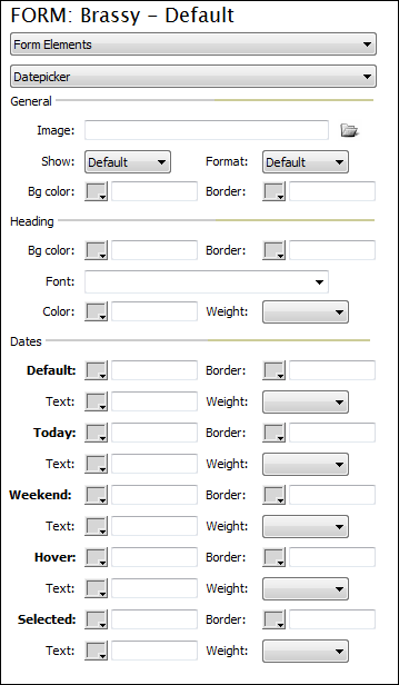
GeneralImage: Click browse to select an image to be used by the datepicker. Show: Choose how you wish the datepicker to appear. Format: Choose the desired format for the date. Bg color: Using the color picker or enter a desired hexadecimal color value for the background color. Border: Specify a border color if desired. --------------------------------------------------------------- HeadingBg color: Using the color picker or enter a desired hexadecimal color value for the background color. Border: Specify a border color if desired. Font: Choose the desired font type for your datepicker. Color: Specify the desired font color. Weight: If desired, choose a font weight. --------------------------------------------------------------- DatesDefault: Is the default day on the calendar. Today: Is today's date on the calendar. Weekend: Saturday and Sunday on the calendar. Hover: The date the cursor is over on the calendar. Selected: The selected date on the calendar. The following three options can be specified for the 5 different dates described above.
|
|