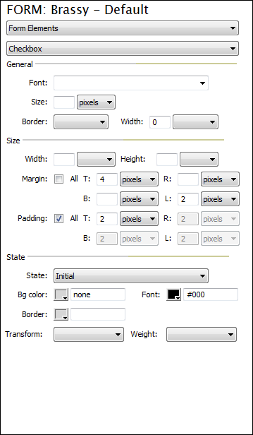
Customizing Design: Form Elements - Checkbox
This interface allows you to customize the text of each Form Element - Checkbox.
GeneralFont: Choose the desired font for your checkbox. Size: Choose the desired font size. Border: Choose a border for the form element, if desired. Width: Choose a width for the form element, if desired. --------------------------------------------------------------- SizeWidth: Choose the desired width for your checkbox. Height: Choose the desired height for your checkbox. Margin All: Select this checkbox if you wish Top, Bottom, Right and Left to use the same setting. T (Top): Enter the value for the Top margin. R (Right): Enter the value for the Right margin. B (Bottom): Enter the value for the Bottom margin. L (Left): Enter the value for the Left margin. PaddingAll: Select this checkbox if you wish Top, Bottom, Right and Left to use the same setting. T (Top): Enter the value for the Top padding. R (Right): Enter the value for the Right padding. B (Bottom): Enter the value for the Bottom padding. L (Left): Enter the value for the Left padding. --------------------------------------------------------------- StateState: Choose the state you intend to edit. This will update the options below. Bg color: Using the color picker or enter a desired hexadecimal color value for the background color. Font: Using the color picker or enter a desired hexadecimal color value for the background color. Border: Specify a border color if desired. Transform: If desired, choose a transform option to change the case of the text. Weight: If desired, choose a font weight. |
|
